This site works best with JavaScript enabled. Please enable JavaScript to get the best experience from this site.
What is the enhancement in mind? How should it look and feel?
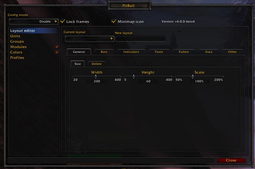
The option to tweak the Alpha and depth/strata of the Aura Highlight module. At the moment when you highlight something it appears above everything: name / buffs / bar etc ... which kills a bit the purpose of highlighting something to me. You have 1 information more visible but at the cost of all the others being washed below the highlight. Being able to put the aura above the background, but below the Texts / buffs icons / bar for instance would be a great thing for visibility. I was able to modify the alpha directly inside the lua files but its a bit lame to have to compromise between an aura not visible enough / or lose the info behind it.
Please provide any additional information below. In the menu "Layout editor > Other > Highlight", and in each "Layout editor > Aura > Highlight" you setup, add some rollover menu with depth position for the highlight, or a Drag cursor from 0 to 30 that could move it from top to bottom of a unit frame The aura Highlight is the most important one definitely.
Thanks in advance for your feedback
To post a comment, please login or register a new account.