This site works best with JavaScript enabled. Please enable JavaScript to get the best experience from this site.
What is the enhancement in mind? How should it look and feel?
Please provide any additional information below.
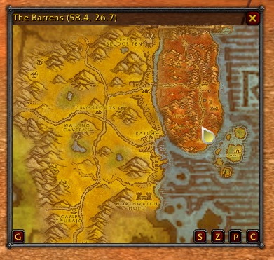
The enchancment I was thinking should be added is a better waypoint arrow. As of right now, its just a square with a blue, white checkerboard design. I beleive it should ACTUALLY look like and arrow, so you don't get confused on which direction you were wanting to go. Also, it keeps BLINKING all the time...and it gets aggrivating. I really like the waypoint system with the coords and using wowhead.com to search for quest coords, but with the waypoint arrow looking the way ti does now..its just aggrivating. Please change it. Thanks :P
That only appears because of a bug, that is the default model when no model can be found, look at ticket 125 for a fix.
Actually I'm curious to know why redundant notes and waypoint modules have been made, instead of directing users to TomTom and HandyNotes, which both seem to work fine with Cart3 (although I haven't tried making a new note yet with HandyNotes).
To post a comment, please login or register a new account.