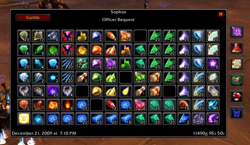
Mobile Vault
MobileVault allows you to take a snapshot of your guild bank and view it from anywhere. The addon also provides item counts on the tooltips, from any vault you have scanned.
Feedback is appreciated, please use the ticket system to report bugs or request new features!
If you are upgrading from a 2.0 version to a 3.0 version your saved vaults will be wiped due to a database overhaul. Rescan your guild banks to get data again.
If you get an error after updating when you mouseover an item, delete your saved variables and rescan your guild banks. If you still get an error file a ticket.
Slash Commands
To access the configuration screen type /mgv or /mobilevault
To show the snapshot window type /mgv show or use the LDB launcher.
Features
- Passive Scanning of the Guild Bank as you browse
- The snapshot frame very closely resembles the real guild bank, navigation is easy
- Adds item counts to the item's tooltip so you always know how many you have
- Tooltip counts can be pulled from multiple guild databases, so you can see your bank toon's guild bank counts from your main
- View any saved vault snapshot from any character with the new Guilds button
- LDB feed for easy access to the vault
Localization
If you would like to help translate Mobile Vault into your language please use the Localization Tool. Also, if you update the translations, please file a ticket about it so I can make an updated release.
Comments


-

Rayvene Owner
-

Sygon_Paul Maintainer
-
View User Profile
-
Send Message
Posted Jun 26, 2017Yes, of course. You can snapshot any guild bank you can view. Obviously if Faenssatan is not in guild X, you cannot snapshot guild X.
But you should be able to view the snapshot of any such guild bank that at least one of your characters has access using the Guilds menu at the top left.
-
View User Profile
-
Send Message
Posted Aug 24, 2015Am I able to save an item list or something to an XML formate or anything with this addon? So I can export my entire guild bank to a guild website or smth?
-
View User Profile
-
Send Message
Posted Jun 26, 2017There is no such feature, because saved variables cannot export to anything other than Lua. However, you can look at your saved variables file for Mobile Vault. The data may be compressed and not human readable. You may have to run the saved variables file through a decompress algorithm.
-
View User Profile
-
Send Message
Posted Aug 29, 2012Date: 2012-08-29 19:30:14
ID: 15
Error occured in: Global
Count: 1
Message: ..\AddOns\MobileVault\Core.lua line 388:
attempt to index field '?' (a boolean value)
Debug:
[C]: ?
MobileVault\Core.lua:388:
MobileVault\Core.lua:377
MobileVault\Core.lua:409:
MobileVault\Core.lua:406
-
View User Profile
-
Send Message
Posted Aug 29, 2012I would try deleting your saved variables. I think that should fix the issue.
-
View User Profile
-
Send Message
Posted Jan 28, 2012Thanks for the bug reports. In the future, filing a ticket on the wowace site is a little easier for me to handle and you don't clutter the comment page with addon lists and debug stacktraces.
I found a very obscure error in the Sharing module, which is fixed in 3.1.6. However, the bug corrupted your saved variables, so I would recommend deleting them and starting fresh to prevent further problems.
-
View User Profile
-
Send Message
Posted Jan 29, 2012Thank you!
-
View User Profile
-
Send Message
Posted Jan 28, 2012Date: 2012-01-28 20:15:17
ID: 12
Error occured in: Global
Count: 1
Message: ..\AddOns\MobileVault_Sharing\Sharing.lua line 64:
attempt to index field '?' (a boolean value)
<snip by Starinnia>
the same like the first post
-
View User Profile
-
Send Message
Posted Jan 28, 2012Date: 2012-01-28 15:25:23
ID: 45
Error occured in: Global
Count: 1
Message: ..\AddOns\MobileVault\Core.lua line 388:
attempt to index field '?' (a boolean value)
<snip by Starinnia>
-
View User Profile
-
Send Message
Posted Aug 10, 2011-
View User Profile
-
Send Message
Posted Aug 12, 2011If it becomes a popular request I can look into adding a search.
-
View User Profile
-
Send Message
Posted May 26, 2011-
View User Profile
-
Send Message
Posted Mar 18, 2011-
View User Profile
-
Send Message
Posted Feb 3, 2011@prometheaa That could be useful. I created a ticket based on your comment. I'll get to it when I can.
It will however only track the last 25 transactions, like the in-game bank. I have no intentions of adding history or any extensive tracking or sharing code the the MobileVault core, since only a tiny fraction of the user base would benefit from it.
-
View User Profile
-
Send Message
Posted Feb 3, 2011Can this also take screenshots of Money Log?
-
View User Profile
-
Send Message
Posted Dec 20, 2010Thanks ^.^
-
View User Profile
-
Send Message
Posted Dec 19, 2010If you get an error after updating when you mouseover an item, delete your saved variables and rescan your guild banks. If you still get an error file a ticket.
-
View User Profile
-
Send Message
Posted Dec 19, 2010-
View User Profile
-
Send Message
Posted Dec 19, 2010-
View User Profile
-
Send Message
Posted Dec 19, 2010